Redesigning Aiimi.com: Simplified, Not Simple.
As part of Aiimi’s internal marketing team, I led the redesign of our website with a clear vision: to evolve the brand’s online presence into something lighter, more refined, and more mature. The goal was to move away from a dense, tech-heavy aesthetic toward a stripped-back, confident design that still feels innovative and distinctly Aiimi. This project wasn’t about removing complexity, it was about presenting it with clarity, purpose, and space to breathe.
One of the key visual shifts was moving away from the sci-fi, “tron-like” cityscapes and digital metaphors that had previously defined much of our visual language. In their place, we introduced more grounded visual assets such as real-world photography, reinforcing a more grown-up and professional identity. This change also helped position Aiimi more clearly across the industries we work in, including water, financial services, utilities, and energy.
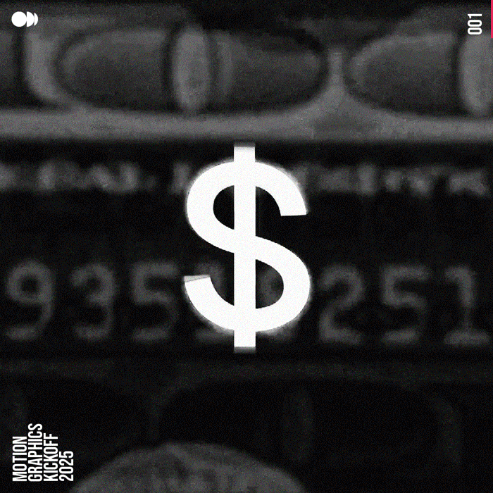
Bringing Aiimi’s Stories to Life with Motion Graphics.
As part of Aiimi’s marketing team, I’ve had the opportunity to work on a wide range of motion graphics, animation, and video projects—both for our internal initiatives and client-facing content. From dynamic promotional videos to engaging animated assets, my work has helped bring complex ideas to life in a visually compelling way.
Whether it’s enhancing brand storytelling, simplifying technical concepts, or creating eye-catching visuals for campaigns, motion design has played a key role in shaping Aiimi’s digital presence. Each project has been an opportunity to push creative boundaries and explore new ways to connect with our audience through motion.
Transforming Aiimi’s Digital Presence.
As part of Aiimi’s marketing team, I had the opportunity to lead the full redesign of our company website. Our existing site no longer reflected who we are—an innovative data and AI company pushing boundaries in technology. The structure was outdated, the user experience needed refinement, and it was time for a fresh, modern design that truly represented our brand.
My role in this project was to rethink the entire website from the ground up. I focused on creating a more intuitive user journey, refining the visual identity, and ensuring that our messaging was clearer and more engaging. Every aspect of the new design was crafted to enhance usability, highlight Aiimi’s expertise, and better serve both potential clients and existing customers.
The annual Escape Studios Careers Guide and its accompanying marketing campaign is one of the larger projects I design collateral for. The Careers Guide itself is printed A4 brochure given to prospective and current students alike, as well as optimised for digital reading through Issuu. My third Careers Guide at Pearson College London and Escape Studios, I incorporated a variety of new layout styles whilst ensuring the piece remained consistent with our wider range of materials. Additional assets created by myself for the campaign included various digital advertisements ranging from static imagery to rotating Gif and animated HTML5 banners.
The core information within this brochure details potential career destinations for individuals keen to start a career within the creative industries. Once the copy was finalised it was important that I made the structure as clear as possible whilst keeping the content aesthetically pleasing. The cover graphic itself is inspired by the iconic and recognisable Escape Studios front desk, offering the reader a subtle reference to many individuals’ first experience entering the institution.
Graphic Design (Digital / Print). Motion Graphics.
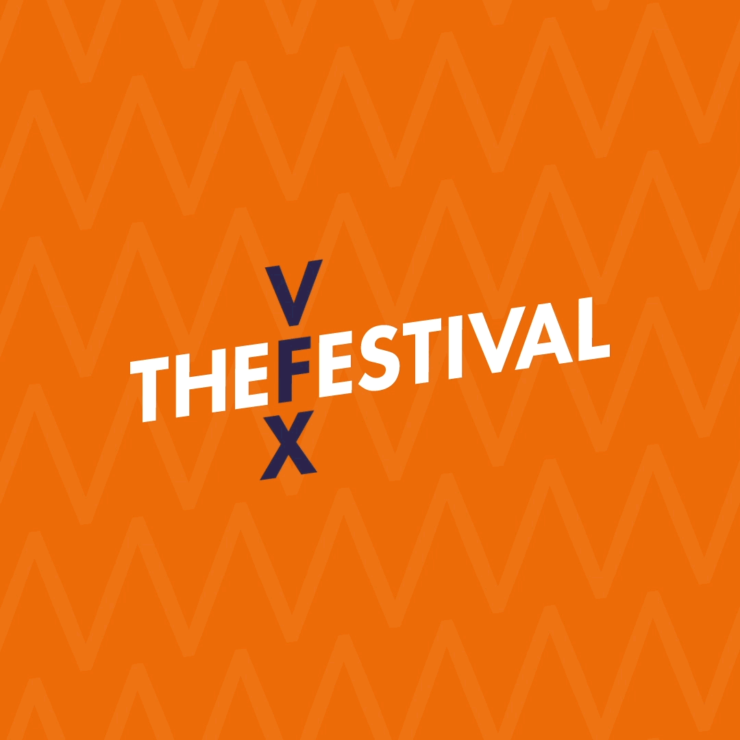
One of the biggest events in the calendar, every year Escape Studios hosts the VFX, Games and Animation Festival. Now in its 8th year, it's known as a celebration of the creative industries and a showcase of talent.
The 2020 rendition of the festival took a new approach to branding with several sub-brands being created to encourage wider audience engagement. I was responsible for the design and creative direction of these new sub-brands. This presented a variety of challenges as not only these new sub-brands needed to first be created, but they had to stay close in nature to the existing VFX Festival parent brand whilst maintaining a strong visual relationship with Escape Studios.
Artworking. Branding. Graphic Design (Digital/Print). Motion Graphics.
The Escape Studios Short Course and Postgraduate Degrees Prospectus
As well as the Careers Guide, Escape Studios also launches an annual Short Course and Postgraduate Prospectus. Now the third I’ve worked on I typically create this towards the completion of the Careers Guide campaign to help stagger my workload between these two projects as well as additional projects I’m also working on.
This years’ iteration was intended to act as a more direct selling piece, opting for more content relating to the courses offered by Escape Studios (and by extension Pearson College London) instead of additional information such as interviews with previous alumni or industry partners. The format was also adjusted from A4 to A5 which helped make the brochure more desirable as a handout at large scale exhibitions such as higher education fairs.
Art Direction. Graphic Design (Digital / Print). Motion Graphics
A multi-channel and multi-brand campaign created to work for two very different schools. The Pearson College London clearing campaign was a challenging project that required strong attention to detail with considerate planning. The creative itself needed to be a flexible and modular construct that could be replicated quickly and effectively on a large variety of mediums, ranging from printed direct mail pieces to animated infomercials.
Art Direction. Branding. Graphic Design (Digital / Print). Illustration. Motion Graphics.
Bubl is a start-up company formed as a hybrid of business and talent development programmes for large companies. I was briefed to firstly create the brand identity of Bubl itself, before following up with a series of marketing collateral key stakeholders could use for internal and external operations. This included printed and digital materials such as brochures, signage and slide decks. I also proposed other marketing collateral such as stationary and business cards.
Art Direction. Branding. Graphic Design (Digital / Print).
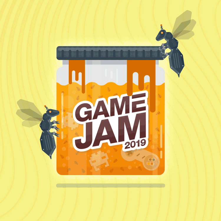
The Escape Studios Game Jam.
I designed the creative identity for the fourth annual Escape Studios Game Jam. This involved the creation of assets over both digital and print domains including digital advertisement, flyers and brochures. I also used my skills within Adobe After Effects to animate the identity into a more engaging and eye-catching format.
The goal of my contribution to this project was to increase awareness and engagement to the event, and drive sign up numbers.
Art Direction. Branding. Graphic Design (Digital / Print). Illustration. Motion Graphics.
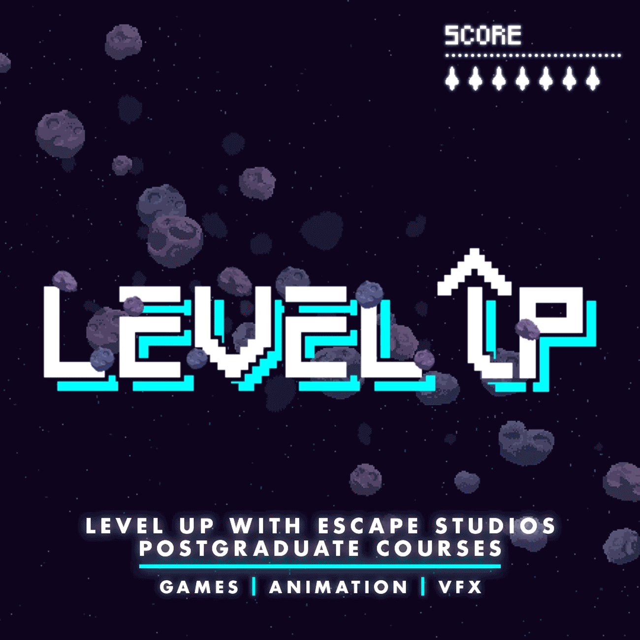
The “Level Up!” campaign was created to attract a higher number of signups to Escape Studios’ postgraduate degrees including Animation, Game Art and Visual Effects.
I was briefed in creating a new identity to match the campaigns tagline of “Level Up!”. Following some research into our competitors I created a visual style similar to the retro gaming genre phrases such as “Level Up!” are often tied to. I created layered artwork consisting of the brandmark and other top layer assets placed over a high resolution 8-bit style background I created. This allowed me to recreate the artwork into a wide variety of formats such as tall or wide digital advertisements as well as printed materials such as the shown maltese cross direct mail. This piece was sent to prospective leads following their registration of interest in any of the postgraduate courses. The puzzle contents was contained the same creative, deconstructed and packaged and was warmly received judging from the social media interactions we received!
Graphic Design (Digital / Print). Illustration. Motion Graphics.
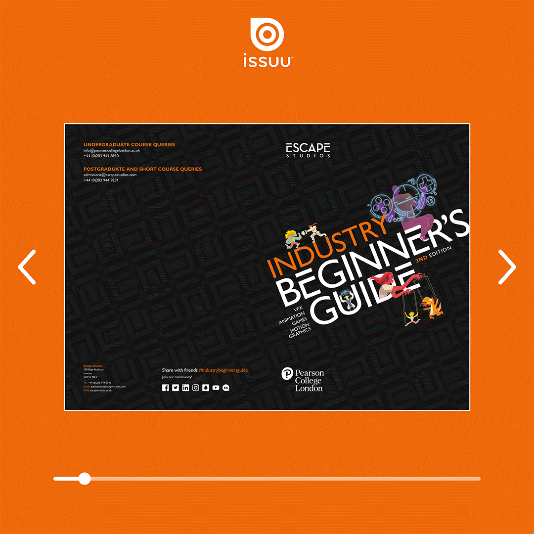
As well as printed brochures, I have also created a wide range of digital brochures uploaded to digital publishing platforms such as Issuu.
The Industry Beginner’s Guide is one of the more recent brochures I designed for Escape Studios. This featured content tailored to both new, old and prospective students looking for a career in the creative industries. The brief asked for an attractive and very visual display of some quite content heavy spreads, where possible I use graphical devices such as infographics to help punctuate blocks of heavy copy.
Graphic Design (Digital).
I take a lot of inspiration from minimalist design approaches such as the Bauhaus movement. I created this piece to follow this same approach but in my own direction, the piece itself is a large format print created through the combination of simple geometric shapes and a minimal colour palette. The piece was entirely made in Adobe Illustrator and highlights my preference of clean, vector-based artwork as opposed to rasterised alternatives.
I also made a version for a close friend using symbolism from our past, the design approach was the same and working with vector artwork allowed for a quick turnaround.
Graphic Design (Print). Illustration.
Asking the people what they think!
You Tell Me is a conversational platform created, performed, shot and run by Akin Omobitan. A voluntary project (for a friend and all-round nice guy!) I created a new brand identity for the project taking inspiration from its original visual identity. Akin used a 50/50 mixture of red and blue as a double entendre to highlight a mixture of opinion whilst also reflecting the target audience’ (us brits!).
The logomark itself is a direct play on the platforms name “You Tell Me”. I furthermore dissected the main graphical structure of the union flag and applied this to create a background graphic which could be used for logo handling and also social posts such as those on You Tell Me’s Instagram and twitter pages. The deliverables also included a large A1 printed poster used to allow Akin to directly attract attention to his live recording sessions in outdoor sessions.
Branding. Graphic Design (Digital/Print).
©WATG
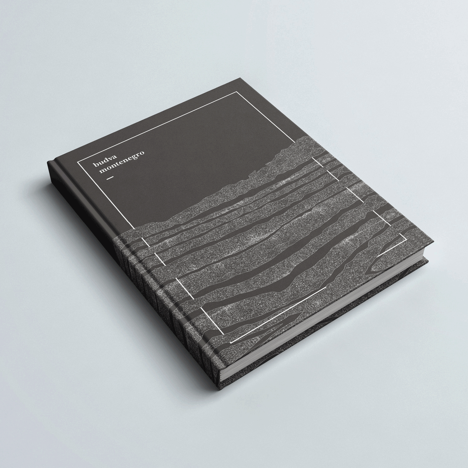
Budva Montenegro
A brochure cover design created for a confidential architectural project in the Budva region of Montenegro. I took inspiration from the regions geological formations when created the cover graphic itself. Budva has numerous exposed cliff faces comprised of several different forms of layered rock including gravel and slate. The layered style of these cliffs are visually represented with the line work of this cover with the inclusion of fritted like patterns to represent gravel. The white frame which encircles the cover represents the architectural structure embedding itself within these well-known geological features.
Entertainment City Doha
A brochure cover design for a confidential architectural project in Doha, Qatar. The inspiration for this cover was taken from the main reception room’s large crystal chandelier, as well as the coastal colour themed walls. Unlike a more traditional materials palette for the region, featuring darker luxury focussed colours such as blacks, greys and golds, the palette I created for Entertainment City Doha© included a variety of blue and turquoise tones.
Art Direction. Branding. Graphic Design (Print). Illustration.
A guide written for students for students. The Escape Inside Guide is a content piece written almost entirely by students, answering questions and giving information directly from a student’s perspective. The challenges presented in the brief for this project included devising an effective pagination structure from varied copy sections put together by different student bodies. The final piece is a mixture of formal and informal layouts encouraging a playful aesthetic.
Art Direction. Graphic Design (Print).